


UX/UI is the foundation, not the decoration
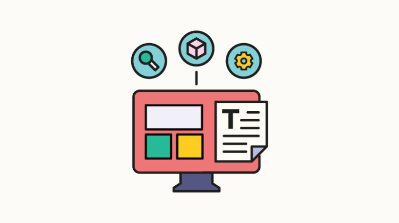
In the world of custom learning, great content isn’t enough. Learners expect an intuitive, engaging and accessible platform that supports their learning experience – not to hinder them. That’s what UX/UI is about to come up. For educational designers, EDTECH UX/UI designers, and e-learning developers, mastering the ELEARNING user experience is not an option.
In this article, we explore the common pitfalls of e-learning design, break down best practices for creating seamless UX/UIs, and highlight them along real-world examples that show how these principles work.
The pitfalls of poor UI in eLearning
Let’s start with the obvious. The lack of visual orchestration kills motivation.
Even with the best written content and the most customized learning journey, learners’ motivation can decline when they encounter courses with bland designs. Let’s dig into general variables as multiple variables are considered for this bland effect.
1. Unbalanced text and graphics and color ratios
Learners are always limited in attention span and memory. Therefore, the larger body of the text and less visual breaks (whether artistic or beneficial) can quickly turn the task of understanding into a struggle to combat boredom.
Using too many fonts, white, too many colors, or too few colors can affect the balance on the screen. The best practice here is to make sure you are achieving a visual balance that complements your great content. It can be helpful to create a style guide for your project that includes key elements such as primary and secondary colors, as well as key elements such as color utilization. It can also show how it works with text blocks within the actual content, including the graphic style you are aiming for.
Once you have selected the primary and secondary colors, you define the amount each will be used. Setting clear proportions allows you to create a consistent, visually balanced style across your content.
2. Unclear and inconsistent design language
A good UI design should not disappear into the background. If learners are busy figuring out how to interact with the platform, they are not focused on what they need to learn.
Ensuring your system is based on a user interface prevents unplanned decisions such as color, sizing, and placement. A good tip is to study a variety of available UI systems, such as Google’s Material Design, and use existing building blocks to your advantage. This ensures that everything the required UI needs is properly and consistently executed for your eLearning project. This is whether you can customize buttons and themes or customize gamer-made interactive packages.
This example would be to set up all templates for all possible types of pages or slides in your project, and the system you created will explain the various possibilities of the content structure.
This shows how to organize different page elements into cohesive layouts using design software (in this case Figma) and shows how all components align and interact with each other in a unified user experience.
3. A fully set up course optimized for desktop use to reject mobile users percentage
This relates to authoring tools that are highly customizable among other platforms. Designing on small screens is no longer an option. The goal here is to start with the smallest possible screen and adapt your design to a larger screen. This ensures that font sizing, clunky and messy layouts, hover-only interactions, and small tap areas are all avoided. This also tells you the button sizing and how much text is displayed at once. A very specific case of this is to create a completely interactive course using software such as the Articulate Storyline. This software offers extremely customizable and wide range of features and coding, but you get what you want to design regardless of screen size. Therefore, it is not a best practice to design interactions based on desktop-only parameters, as they are likely to be translated badly when viewed on mobile.
Screen capture of courses built with clear storylines using custom UI. Note: Tapping a target such as a button should be at least 38×38 pixels to ensure easy interaction on your mobile device.
4. Weak visual hierarchy
This will return to the system you created for the project. Courses that do not visually define content structures can easily become boring even if they are not confused. Using the right style scale ensures sufficient clarity. And in the meantime you need to make sure you have at least two scales, desktop and mobile scales. And the best practice here is to use two fonts for the heading, the other for the body text and buttons. This rule has been tested and tested since the invention of prints, and helps learners to more easily identify sections of the course and pin them to their learning journey. Another point you should be aware of is to make sure that it occupys the font size across different languages, if applicable. The size of a point or pixel changes from one font to another, and from one language to another. So, 16px is a rule for mobile font sizes, but it’s not always true for all language and font choices. Make time to test and compare.
Examples of text style scales for mobile and desktop.
5. There is no sufficient attention to detail
After processing all the points above, the thoughtful use of animation, transition and feedback animation makes the interface more lively and sensitive. To make the animation more modest and enhance your action, it creates a better experience for learners, such as checkmarks when modules are completed and subtle movements when hovering interactive elements.
Now that we’ve covered the issues with UI, let’s dive into ways that paying attention to specific UX pitfalls can enhance your learning journey.
The pitfalls of poor UX in e-learning
1. Non-user-centered design
Designing a learning journey without a proper research and a thorough understanding of learners can turn into wasted time, effort, and resources. To avoid this, start with the learner in mind. Understand their goals, challenges, technical habits and accessibility needs. Creating learner personas will help you adjust your learning preferences and goals to avoid learner problems. On the other hand, mapping users’ journeys puts you in your head and ensures that priorities are important. This validates decisions made and increases relevance, motivation and retention.
2. Insufficient timeline disclosures and instructions during the learning journey
Imagine starting a new online course. Before you begin with an introduction, you will receive messages and instructions about items you have not yet interacted with. This applies strongly to gaming courses. And they should be handled using the right gaming UX. It is gradually mounted on learners and only consider dissipating relevant instructions and tips as the journey unfolds. This can be easily achieved when the journey map is running properly. At that stage, you can see how much and when you are disclosing. Another step that can identify this is that during user testing, feedback can be collected from users regarding onboarding the course.
Examples of courses that gradually reveal content will guide learners step-by-step, maintain focus and avoid cognitive overload.
3. Long read, no breaks, passive information dump
With obvious, never-ending content, learners can avoid completing the course. Microlearning supports modern learners who prefer fast, digestible content. It also matches well with repeated intervals to obtain better knowledge retention. To achieve that, designing modules that are 3-7 minutes long is a way each focused on a single learning goal. It also helps if you have a clear set rhythm on your learning journey. An engagement skyrocket when learners “do” instead of “clock.” Interactiveness reinforces concepts and intrigues learners. Examples provide short scenario-based content followed by short questions that help to reproduce the information and keep it faster. Other tactics are:
Gamification (Points, Badges, Leaderboard) Animated Transitions derive attention microinteractions (hover effects, visual feedback)
Screen capture of interactive activities designed to help learners explore their interests and uncover what really drives them.
4. Accessibility and Inclusiveness
Accessibility is more than just compliance. That’s an opportunity. Designed for users with disabilities, it boosts creativity and makes content better for everyone.
Follow the WCAG principle: Provide ALT text for all visuals, use transcripts and captions for media, ensure keyboard navigation works smoothly, maintaining color contrast and scalable text.
Creative Tips: Accessibility is not boring. Use haptic feedback, audio cues, or visual progress bars to enrich all types of learning.
Accessibility testing tools ensure that your design choices meet compliance standards and, more importantly, create a comprehensive and user-friendly experience for all learners.
Summary: UX/UI is a strategic advantage
In eLearning, UX/UI is not a decoration. That’s the foundation. The excellent course design balances form and functionality. Make learning easier, engaging and comprehensive. And when done correctly, it drives real results: better retention, higher completion, and empowered learners.
If you are building or improving your custom eLearning, we focus on:
Learner-oriented designs are not systems that keep the system clear, simple and interactive, they do not guarantee accessibility as strength, and are not limiting that prioritizes mobile usability from the start
At Kashida we build with these principles in mind. Because design isn’t just about how it looks, but how well it works for all learners.
Cassida
We are about learning. Let me explain it briefly. Design and create custom learning content, distribute it across multiple platforms, and always enrich your learning with technology.