


Asking prices have fallen in many areas of the country as real estate agents look ahead to the busy season. Dive into your market and compare it to hundreds of other markets using Inman’s interactive maps and charts.
Home prices are holding steady in most parts of the country, despite years of weak transactions due to rising mortgage rates.
But some of the areas that saw the lowest price increases during the housing boom early in the pandemic are seeing a new surge in cautious pricing by agents and their clients, according to Inman’s analysis of the latest Realtor.com data.
And even though many agents are expecting a healthy increase in sales, this trend is contributing to a slight decline in list prices nationwide heading into the spring and summer seasons.
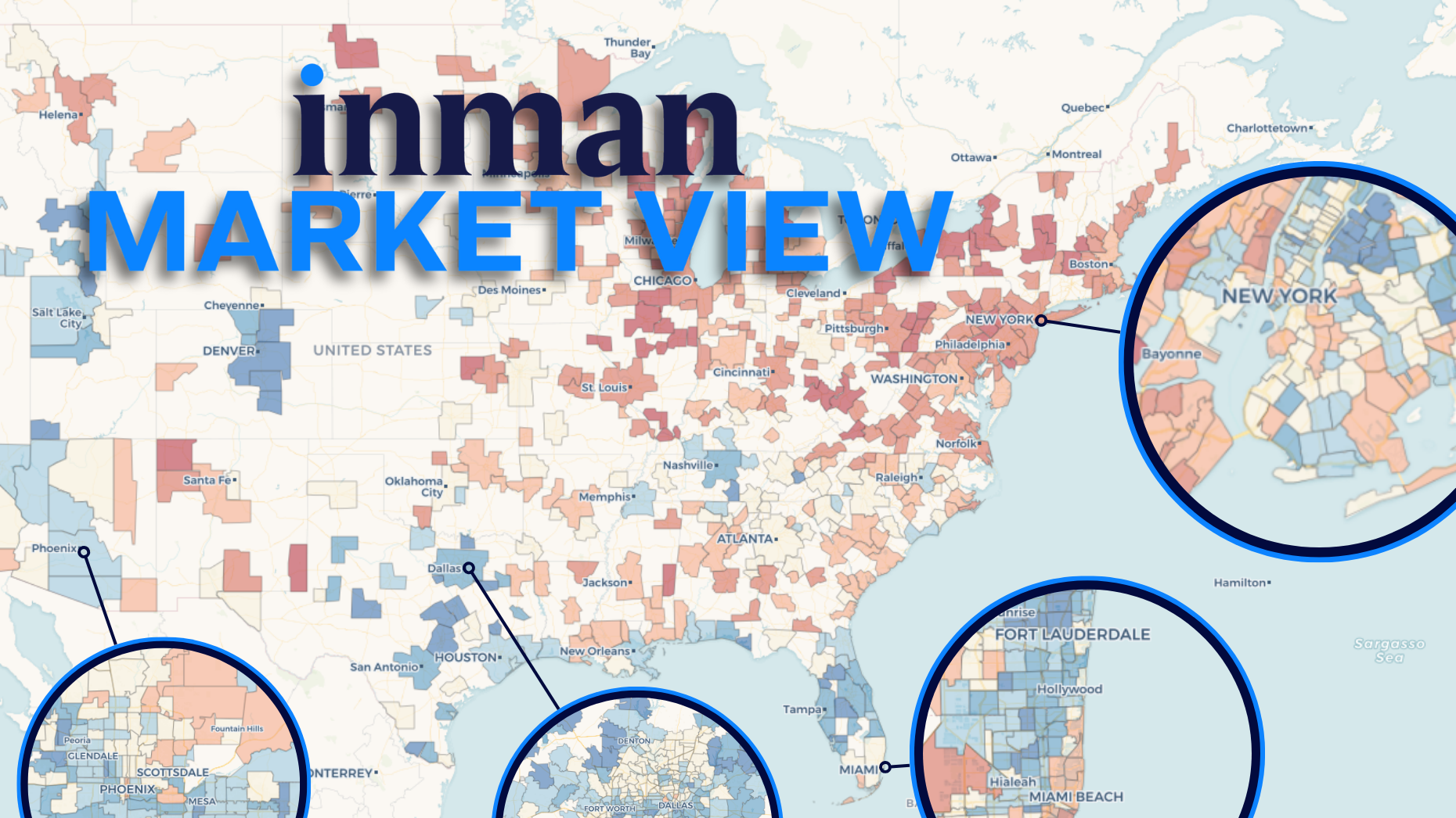
Explore the Inman Market View interactive data tool on this page to see how the markets compare.
Click on one of the 500 local markets in the tool above or explore the options from the drop-down menu to explore the data in even more detail. For a more complete picture, choose to compare different metrics and time periods.
conservative question
Nationally, price growth continues to slow, and that trend is now reflected in home sellers’ asking prices.
Residential property prices this winter were initially 44 percent above pre-pandemic levels for the period, showing how much the pandemic boom continues to weigh on affordability today. But that list price mark was down from 47% above the market’s pre-pandemic norm in fall 2025.
At the local level, this is playing out very differently.
Some major markets, including the New York City and Miami metropolitan areas, are showing signs of stabilizing prices and sellers are regaining confidence in setting their asking prices.
However, more and more places are strategically lowering prices on the eve of the spring season. And some markets are seeing more dramatic downward pressure on prices.
Cumulative increase in listing price from pre-pandemic “normal”
Autumn market → Winter market
Greater Austin Area: +34% → +27% Greater Silicon Valley Area: +25% → +18% Greater Washington DC Area: +31% → +25%
These three cases are more extreme than the typical US market, and each has its own story that helps explain the recent loss of pricing momentum.
However, regional employment hubs have some things in common. Active listing inventory has increased recently, enjoying or maintaining price increases from the pandemic boom period.
In the case of Austin and Silicon Valley, housing supply has been supported by an unusual surge in new listings since the beginning of the year.
Using the Inman Market View chart above, you can search for your own market and compare its trajectory to other markets through various metrics and time comparisons.
inside the market
The downward trend in prices in the nation’s capital may not be as easily explained as in other markets that have experienced steep price declines.
The map below shows that neighborhoods across the greater DC area have participated in list price declines over the past year, but some of the hardest hit neighborhoods have been wealthy enclaves well away from the District itself.
This suggests that it’s not just a matter of “federal worker layoffs,” but that the biggest price changes near Washington, D.C., may be related to changes in top government and agency leadership, the fate of big-ticket government contracts, and other special working classes living near government seats.
Most markets don’t have such deep discounts. In many places, we are seeing prices continue to rise or even gain ground.
But if prices continue to fall in a growing number of cities across the country, it could affect how many customers choose to list and buy this spring.
Methodology note: This month, when calculating the 2017-2019 baseline average for each metric, Inman adjusted its approach to better account for the annual December-January spike. The basic concept remains the same, but the trends from December to January should be smoother and more comparable.
Email Daniel Huston